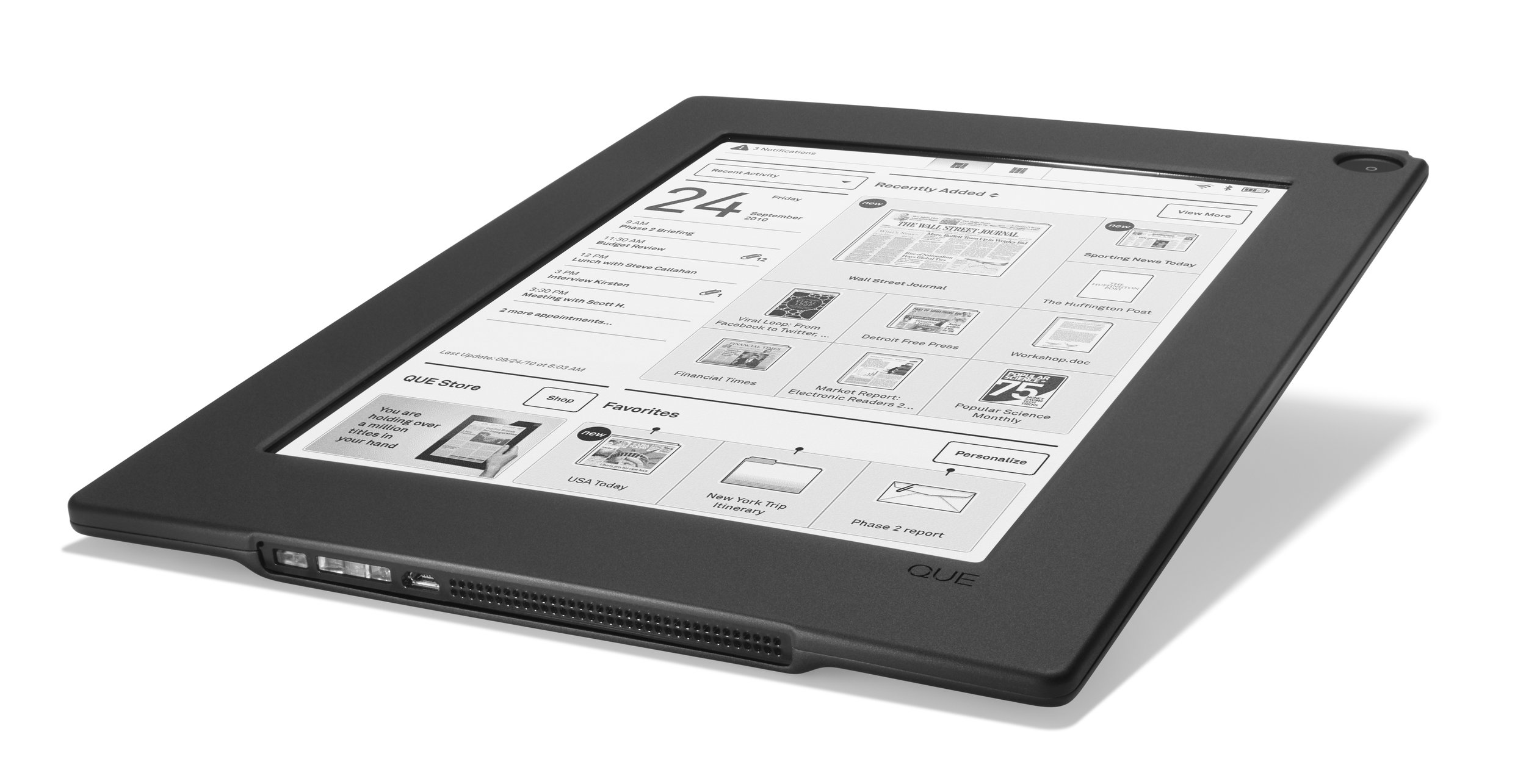
QUE proReader | Role: Interaction Design Director
The QUE proReader was recognized as one of the ten best products introduced at the 2010 Consumer Electronics Show. Targeted towards enterprise users, it featured an elegant industrial design and an intuitive interface designed to manage business documents and streams of subscription content.
Distinctive E-Reader Designed for Business
The QUE proReader was designed for business users. It offered easy access to calendar events, email, associated documents, streams of subscription content, and other user-generated documents. Weighing less than a pound, the QUE ProReader featured the largest shatterproof touch screen on the market. The device received an International Design Excellence Award from the Industrial Designs Society of America in 2010.
In the Media
Less Weight, More Resolution
With a plastic electronic backplane, the QUE proReader was a fraction of the weight of other e-readers. Rugged and thin, it displayed high-resolution and high-contrast images considered by many at the time superior to color displays for reading.
State of Flow
With a minimalist interface that leveraged the high-resolution e-ink display, users could access and annotate content. Streams of subscription content could be easily accessed, keeping users up-to-date on their latest preferred publications.
Documenting the Design
Working closely with industrial designers, mechanical engineers, and the software team, interaction flows, and screens were designed for each device state. These include the home page, document viewing, access and management, document markup and editing, calendaring, and a catalog of gestural touch screen interactions.
Que Gallery