Folds.001.jpg

Mercedes-Benz S-Class Visual Interface Exploration | Role: Interaction Design, Interaction Design Director, Client Relationship Lead

This project sprint explored a range of visual interface design approaches to inform the wide display layout of the 2012 Mercedes-Benz S-Class.


A Visual Sprint

This short visualization sprint augmented Mercedes-Benz’s design team. It helped them cover new ground in exploring a wider range of visual interface aesthetics than the in-house team did. Themes that expressed luxury, purpose, restraint, personalization, and a sense of feeling alive were all explored.


Client Perspective

 
The explorations your team provided will help us think much more broadly about interface aesthetics for the upcoming S-Class as well as future Mercedes-Benz and Smart vehicles.
— Vera Schmidt - VP Advanced Digital Design Mercedes-Benz
 
MBRDNA Logo.jpeg


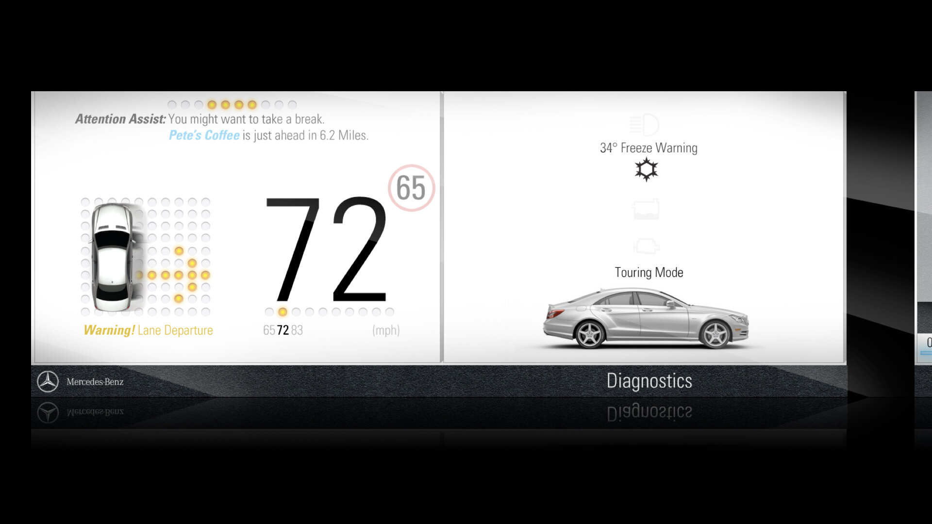
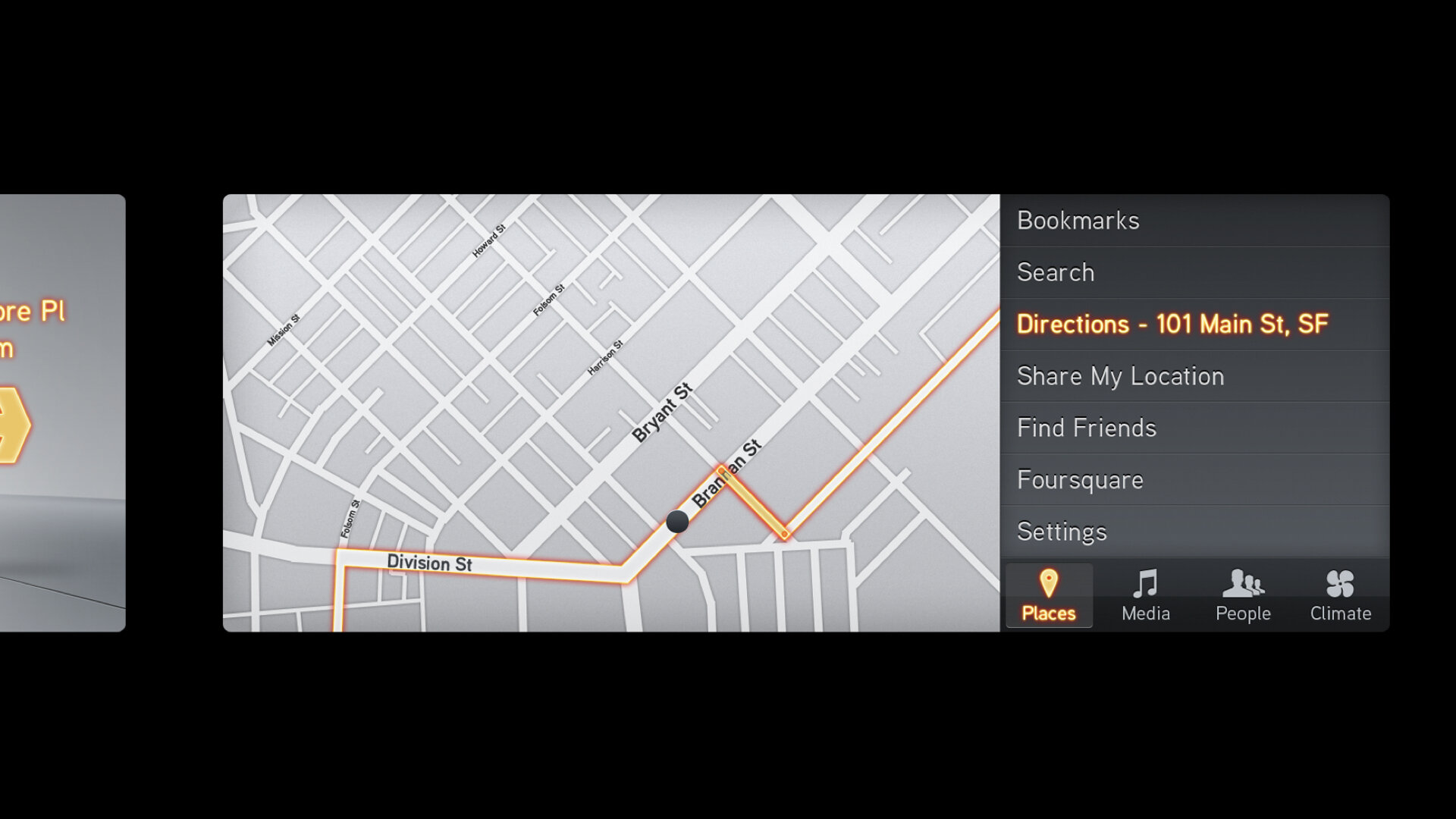
Folds: See what you want to see with expanding customizable modules

Telemetry and diagnostics are on the left. Configurable context and comfort on the right. Multitask easily with customizable horizontal modules. Maintain context: Expand any module without losing sight of the others. Structured Revelation with important diagnostics always in view. The smart cluster sees things that you may not.


Layered Aesthetic

Glanceable on the left. Tiered interaction on the right. Important information is persistent. Relevant actions are always in view. Dials are both spacial and numeric. Direct representation: Vehicle image indicates which lights are on and off.


Depth of Field

Glanceable on the left. Approachable interaction on the right. Leveraging the “New Familiar” visual language of apps. As familiar and simple as a tablet. Smart focus: What’s important stands out. Expansive free space is distraction-free.


Mercedes-Benz S-Class Visual Interface Exploration Gallery